

Exploring the Running Economy of a British Champion - Jo Wilson
Earlier this year we had Joanna Wilson in and we carried out some run economy testing. Jo is an ultra-runner and was the 2022 British 100km champion and 14th at the World champs which is why we were interested to capture data to help understand some of the factors that contribute to her performances over these distances.
For reference, her average pace for 100km is ~4:35/km. Which is the equivalent to doing 10 consecutive 10kms under 46-minutes. Based on this fact alone you already know Jo is a going to exhibit attributes of an efficient runner. But how efficient? Let’s look at the data and see what it tells us. Thanks to Jo for allowing us to share the data.
Determining Thresholds
For endurance sports; there are 3 main factors that we are attempting to influence with training, Aerobic capacity, Anaerobic Threshold and Aerobic Threshold.
Aerobic Capacity
Aerobic capacity, also known as VO2 max; is a measure of the body's ability to utilise oxygen during intense exercise. It represents the maximum amount of oxygen that an individual can take in, transport, and utilise per unit of time. VO2 max is commonly expressed in milliliters of oxygen per kilogram of body weight per minute (ml/kg/min) and is considered one of the most important indicators of cardiovascular fitness and aerobic capacity.
While we didn't test her VO2 max we can use the data we have to estimate her VO2 max. Her VO2 max is in the region of 55ml O2/kg/min. While this is relatively high for a female runner it isn't the top end of elite runners so there is potential to improve this.
Anaerobic Threshold
The anaerobic threshold is the point at which the aerobic system becomes insufficient to meet the increasing energy demands, and the anaerobic energy system starts to contribute significantly. The anaerobic system relies on the breakdown of stored carbohydrates (glycogen) without the need for oxygen, leading to the production of lactate as a by-product.
Based on the above VO2 max. Jo’s Anaerobic Threshold (AT) is at ~80% of her VO2 max which is good but there is likely scope to improve this if she chose to focus on developing her threshold and wanted to run faster for the shorter distances. This threshold occurs at ~3:45/km (16km/h) which couples nicely with her 10km times of ~37:30 and a 5km time of ~18 minutes. While both her VO2 max and Anaerobic Threshold are good they don’t tell us the full picture of what will happen as the distances get longer and we would likely expect to see quite a few runners who would be faster than Jo especially over the 5/10km distances. To get a better understanding of endurance events we need also look at the Aerobic Threshold.
Aerobic Threshold
During aerobic exercise, your body primarily relies on oxygen to produce energy to fuel your muscles. As the intensity of exercise increases, so does the demand for energy. Initially, your body can meet this demand through the aerobic system, where oxygen is used to break down carbohydrates and fats to produce ATP (adenosine triphosphate).
However, there comes a point at higher exercise intensities where the body's demand for energy surpasses the capacity of the aerobic system to supply it. This is when the aerobic threshold is reached. At this point, the body starts to increasingly rely on a small amount of energy from the anaerobic energy system. As a result, there is a buildup of lactate and other by-products, leading to an increase in blood lactate concentration from resting levels.
Jo's Aerobic Threshold is very good at ~69% of VO2 max which is in the upper end for most athletes. The pace at this threshold occurs was ~4:36/km and couples nicely with her race pace for the 100km.
For reference, marathon pace typically falls within 70-80% of VO2 max.
However, If we had two runners with all of the above being equal we still wouldn't be able to identify who is the more efficient runner especially when looking at potential over 100km of running.
Metabolic demand vs Oxygen uptake
One of the ways we can look to see how efficient a runner is; is to compare the metabolic / oxygen demand vs the actual oxygen uptake. We've previously looked at how this compares with different runners (read here).
As you can see from the graph below which plots the theoretical metabolic demand for energy vs the actual oxygen uptake, Jo’s Oxygen uptake at each of the velocities we tested is relatively low; meaning she needs less oxygen to run these paces than what is theoretically needed. This shows she is efficient at converting the oxygen she is consuming into mechanical work. Probably the most interesting part of this data is that as Jo runs faster there isn't a significant increase in the oxygen being consumed which we see in the next graph with regards to running economy.

Running economy
If we take the oxygen uptake and divide it by the velocity, we can calculate running economy (this is the amount of oxygen needed to cover 1km) we get a better understand of how efficient Jo is as a runner.

From the above graph, we can see that her running economy is very good with the maximum amount of oxygen needed to run 1km was 174ml / kg. This is a very low number (anything around 200ml O2 /kg / km is considered good) and shows her good efficiency to turn the oxygen she consumes into mechanical movement.
What contributes to this efficiency?
This is quite a difficult question to answer as there isn’t one metric that controls it and a number of factors all work together to maker it happen.
Genetics
There a high amount of genetic luck (she must have chosen her parents well) although how much this contributes is impossible to define.
Biomechanics
How you run plays a big impact in your running economy and there are some metrics we can measure to understand what is efficient and what is maybe less efficient. We've included a few of these metrics with more detail below.
Muscle fibre composition
Runners with a higher percentage of ‘slow-twitch’ (Type I) muscle fibres tend to have better running economy as these muscles are optimised for working aerobically and tend to require less overall energy to contract. Runners who have higher percentages of ‘fast-twitch’ (Type II and Type IIx) muscle fibres tend to have lower running economy as these muscles are great at generating higher levels of power but tend to rely more heavily on energy from the glycolytic system.
Joint flexibility
Conversely to many peoples belief, running economy is often better in runners who have slightly stiffer joints. As, stiffer joints require less energy to stabilise and contract often returning more elastic recoil. .
Training
Possibly one of the main contributors is down to training and being able to consistently accumulate miles over time in that her body becomes more efficient from hours of training focused on improving her endurance.
Running Biomechanics
Foot Strike: As with most runners, the foot strike pattern changes as the velocity increases. Jo tends to start more forefoot and as she begins to run faster, she moves towards the mid-foot. It should be noted that there isn’t a direct correlation on foot strike patterns and running efficiency. However, often what will happen as runners begin to run faster is that in an attempt to increase stride length they begin to land more towards the heel (mainly because they can't get their foot underneath them fast enough) and this consequently costs more energy and impacts running efficiency and not to mention greater injury risk so the factor Jo doesn't begin to overstride as she is running faster helps her efficiency.

The above graph shows the change in foot strike pattern as Jo increases her velocity. The image below is a plot of her foot strike pattern during the test. The brighter the colours the more impact there is.

Contact time vs Flight time
In the next two graphs we are looking at the time Jo spends on the ground (contact time) compared to the time in the air (flight time). More efficient runners spend less time on the ground and more time in the air compared with less efficient runners. .

From the above, we can see that Jos contact time decreases as she begins to run faster, ranging from ~243ms to ~217ms (a 10% reduction in ground contact time), nothing out of the ordinary there but as an ultra-runner her GCT is relatively low.

If we then look at her flight time (above graph), we don’t see it change much at all only ~5ms difference between the different velocities, this is quite interesting as it suggests that as Jo runs faster and with her contact time coming down, she doesn’t increase her time in the air. Instead her cadence gradually increases and with her lower contact time she is effectively just bouncing off the ground at a faster rate.

When we look at both of the above graph together, we get something called flight ratio (the ratio of time spent in the air vs on the ground). While there’s not an exact number that we are looking for the higher this number at a given pace the likelihood your running efficiency is going to be better. However, it should be noted that this is pace dependent as we run faster, we will tend to see improvements (reduction) in contact time and an increase in flight time giving a change in the flight ratio.
Leg Spring stiffness
One of the factors that contribute to a low ground contact time is our ability to bounce off the ground which means we need to be able to handle the large impact force we create when our foot hits the ground.
When running with cushioned shoes, the softer foam will help take up some of this initial impact but will also reduce our ability to rebound off the ground more effectively as the cushioning in the shoe compresses under this load. Now if you place a material such as carbon into the shoe with cushioning it will reduce the load on the lower body but it will help maintain some stiffness and help us to rebound off the ground (for reference the Jo was using the Nike Alpha Fly next % 2 during the analysis).
We can evaluate this with a metric called leg spring stiffness. Generally the higher the leg spring stiffness the less the spring will compress under the load of our body when we hit the ground and resulting in more rebound off the ground. In Jo’s case she exhibits a good level of leg spring stiffness as is slighter better than other runners, running at a similar pace. Alongside this, we can look at how this leg spring stiffness converts into force over time. This is comprised as a vertical and horizontal component and called the ground reaction force (GRF). For these metrics we are looking for a relatively higher vertical Ground reaction force and a relatively low horizontal ground reaction force (Forefoot runners will tend to have higher horizontal ground reaction forces). From Jo’s data she exhibits this as shown below and we can see that these values are symmetrical on the right and left (when runners have an imbalance we will see these values be different between left and right legs)


Fuelling:
For such a long endurance event, glycogen preservation is important and avoiding the dreaded ‘bonk’ is critical for success and having the ability to not slow down in the later stages due to your body running low on glycogen.
The rate of carbohydrate combustion can be determined using the respiratory exchange ratio (RER),
The (RER) is derived by comparing the amount of carbon dioxide (CO2) produced to the volume of oxygen (O2) consumed, represented as VCO2/VO2. The respiratory quotient, usually falling within the range of 0.7 to 1.0, serves as a crucial marker for determining the metabolic fuel or substrate being utilised. Its accurate computation demands resting or steady-state exercise conditions. A ratio of 0.7 indicates a blend of fat usage, while a ratio of 1.0 points towards the exclusive consumption of carbohydrates. Hence, during low-intensity, steady-state exercise, the RER typically fall between 0.80 and 0.88, indicating the dominant utilization of fatty acids as the primary fuel source.

As we can see from the above graph, Jo’s RER value ranges from 0.85 to 0.8. The higher RER value at 5min/km pace is likely from the first couple of minutes from the test where the RER value will be higher due to the first couple of minutes of running where the body uses mostly energy from Anaerobic pathways before the aerobic system takes over.
For understanding fueling requirements, we are most interested at the pace that correlates to her race pace and looking at the amount of carbohydrates being utilised. At this velocity, we see an average RER of 0.82. this equates to ~60% fat and 40% Carbohydrate being utilised.


We can calculate the calories being burned at each velocity by diving the Oxygen consumption in litres per minute by 5 (as each litre of oxygen burns 5kcals) So for Jo, at ~4:35/km she is burning ~815 kcal per hour. We know that 40% of this is carbohydrates from the RER which allows us to calculate a total of 326 kcal/hour of carbohydrates.
To convert the calories into a more meaningful number (grams per hour) we need to divide the calories per hour by 4 (As there is 4 calories in a gram of carbohydrate) this gives us a total of ~82g/hour or a carbohydrate utilisation rate of 1.3g/minute.
Using the above data, we can then plot the below graph which shows the fat and carbohydrate utilisation in grams / hour

On the above graph we have also plotted the horizontal green bar which indicates the range of carbohydrate that is widely accepted as the maximum exogenous carbohydrate intake. Although the absolute rate of carbohydrate intake does depend on the type of carbohydrate being used (with more recent research suggesting up to 120g is achievable). But a range of 60-90g is a good gauge for most cases. This horizontal green line can help us show the general range we want to see carbohydrate utilisation sit to ensure we can ensure our fueling targets are maintainable. When our carbohydrate utilisation exceeds this range, we begin to deplete our stored muscle glycogen. It is useful to know the rate of glycogen depletion as we can then use this value to determine optimal fueling strategies and ensuring we can ensure we keep sufficient glycogen in the body to avoid hitting the wall.
Knowing this rate allows us to create the following graph where can use the glycogen depletion rate and plot the rate that glycogen is being depleted over time with different fueling strategies to plot the points where an athlete begins to get towards running out of glycogen (noting that this is theoretical and complete glycogen depletion never occurs)
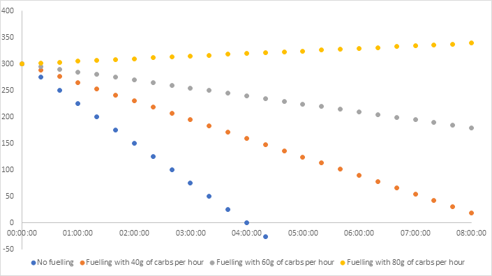
From the above graph you can see how Jo’s glycogen takes a long time to deplete even with no fueling or relatively low levels of carbohydrate (40g) intake.
For her race duration of ~7:30 hours fueling with only 40g/hour will result in glycogen depletion aka hit the wall sometime after 5 hours and would not be a recommend fueling strategy.
With a carbohydrate intake of ~60g/h we can see that the likelihood of glycogen depletion becomes quite low especially up to race duration so should be a good target based on the above data. During the analysis Jo mentioned her normal race nutrition plan is to fuel with ~80g/hour. Which is ~1.1g/kg/h which is inline with the amount of carbohydrate she is utilising at her race pace but she also commented that she will often be sick during the longer events (while this is quite common at ultra-endurance events) it is likely the case that the amount of carbs she is consuming is slightly higher than her bodies ability to break down the fuel which results in the body rejecting the surplus carbohydrates.
It should also be noted that hydration and salt intake also impact the ability to metabolise carbohydrates so this might also play a factor.
From all the above data, Jo is efficient at burning fat for fuel at her race pace and is one of the characteristics that help her maintain the pace for the race duration.
From a fueling standpoint, she is theoretically capable of running faster as the there is not a big change in carbohydrate utilisation.
Summary
All of the above data gives a slight glimpse into what an efficient endurance runner looks like, there are many other factors to consider that make up the reasons why Jo can run as well as she does for this distance.

One of the key and most important factors is that Jo is an avid runner and enjoys running so whether she was born with genetic gifts that allowed her to become such a runner or just the fact she loves running that her enjoyment of the sport is what allowed her to accumulate the weeks, months and years of miles needed to build the engine and refine its efficiency!
While for some runners may never be able to sustain 4:35/km for 1 x 10km let alone 10 of them back to back there are always areas we can identify to work on and improve but if you enjoy running the improvements are outcomes more than targets.
We'd love to hear your feedback and comments on this blog and any other topics you'd like us to discuss.